Brand Strategy · Brand Architecture · Visual Identity · UX/UI · Social Media
Aquí es Oaxaca
A family-owned hospitality group dedicated to preserving and sharing Oaxacan traditions through restaurants, products and experiences rooted in a story that has connected Oaxaca and Mexico City across generations.

00/01
The diagnosis
Problem
Casa Nela, Oaxacaquí and Aquí es Oaxaca Tienda shared something far deeper than a category: they were all part of the same family story. Yet that relationship had never been structured into a brand system capable of explaining what connected them, what made each concept distinct, and how they could grow together without losing their individual identities.
Objective
Build the identity of Grupo Aquí es Oaxaca and create a brand architecture capable of organizing its different businesses around a shared origin, giving each brand a distinct territory while establishing a platform that could expand into new products, experiences and touchpoints.
Before designing the system, we traced the history behind the group. It did not begin with a restaurant or a logo, but several decades earlier.
In 1961, a newly married couple arrived in Mexico City from El Tule, Oaxaca. Years of hard work, constant travel between Oaxaca and the capital, and the involvement of successive generations gradually built a relationship between family, commerce and food that would eventually lead to Oaxacaquí, Casa Nela and Aquí es Oaxaca Tienda.
Understanding that history changed the nature of the project. We did not need to invent a concept to connect the brands. We needed to find a way to turn a story that already existed into a structure capable of supporting them.
-
01
There was a shared story, but no structure to make it visible. The different concepts shared an origin, products, knowledge and traditions, but the relationship between them had never been articulated through a clear brand architecture. The first challenge was defining what should belong to the group and what should remain unique to each concept.
-
02
Sharing an origin did not mean sharing a personality. Casa Nela and Oaxacaquí are both Oaxacan restaurants, but they serve different experiences and occasions. Aquí es Oaxaca Tienda translates that same origin into products people can take home. Making all three brands behave the same way would have erased precisely what gives each one a reason to exist. The architecture needed to create a sense of belonging without creating uniformity.
-
03
The origin needed to become a platform for the future. The family story had to do more than explain the past. The new structure needed to make room for new businesses, experiences and generations without losing the connection to what started it all. The Group brand was therefore designed not only to provide institutional strength, but also to create a foundation for future growth.
The challenge was not to create a story for three brands. It was to build a system capable of making visible the story that had always connected them.

00/02
Designing the system
The architecture was built around a Group Brand + Endorsed Brands model. Grupo Aquí es Oaxaca acts as the institutional structure that protects the shared origin, values and brand DNA, while Casa Nela, Oaxacaquí and Aquí es Oaxaca Tienda retain their own territories and personalities.
The Group brand was intentionally designed to maintain a discreet presence. Its role is not to compete with the brands it brings together, but to provide context, coherence and a structure from which they can evolve.
-
01
A shared root
The Tree of Tule became one of the central elements of the visual universe. More than a geographical reference, it connects the identity to the family's place of origin and to ideas that run throughout the project: roots, permanence, growth and continuity across generations. The illustration system expands on this language through Zapotec and Mixtec geometries, Oaxacan textiles and references to traditional printmaking.
-
02
Oaxaca, without turning it into a cliché
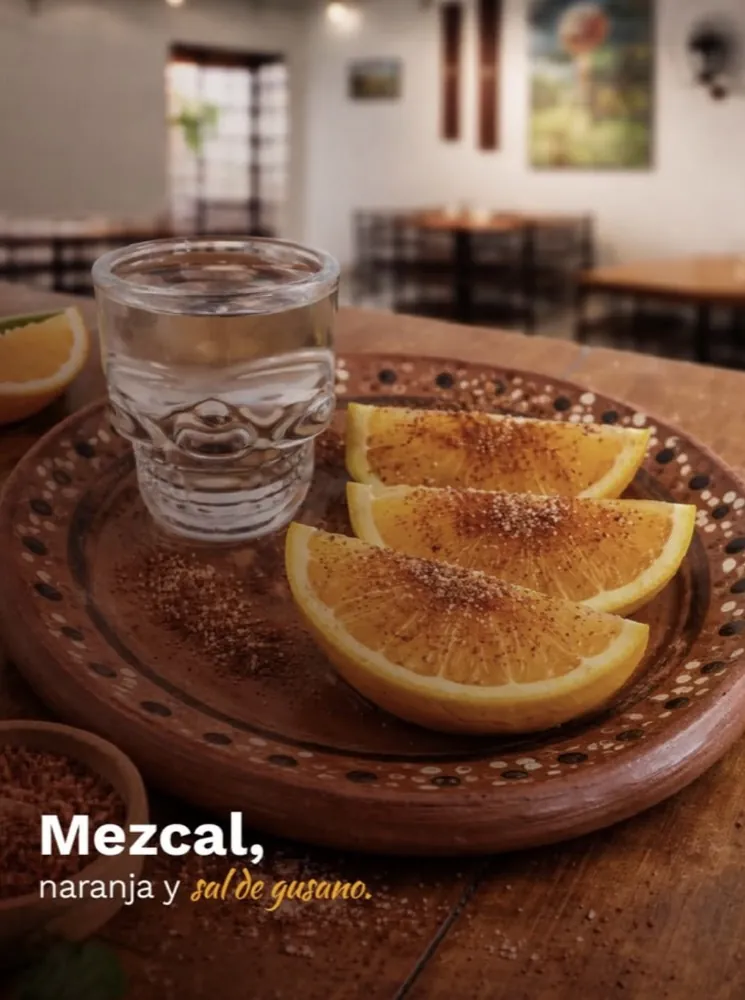
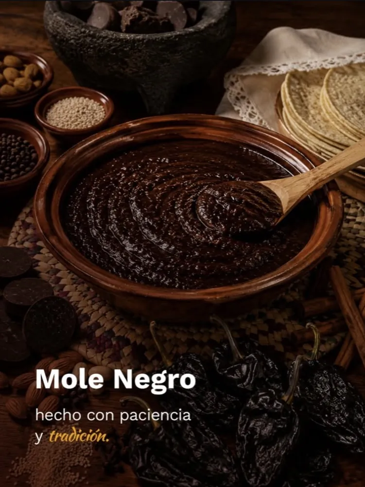
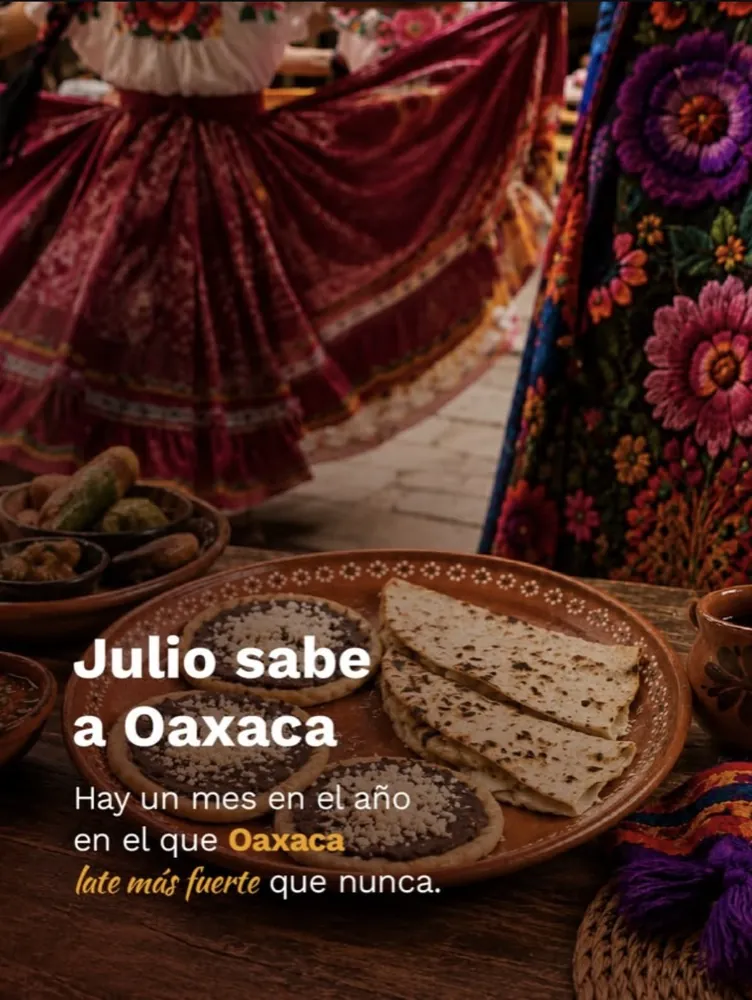
The identity needed to acknowledge Oaxaca's extraordinary visual culture without reducing it to a tourist image or an exaggerated folkloric aesthetic, so cultural references became building blocks rather than decoration. The palette combines dark brown, gold, sand, stone gray, coral and agave green; Cinzel Decorative and Work Sans balance character and functionality. Photography follows the same principle: real, human, warm and timeless.
-
03
One DNA. Three territories.
Coherence across the group does not depend on making every brand look the same. It comes from shared values, selected visual codes and a common story, while allowing each concept to occupy a distinct territory.
-
04
The story is part of the identity, too
A strategic platform defines the group's purpose, mission, vision, values, personality, tone of voice and narrative territories. Its purpose, in one idea: keeping Oaxacan identity alive through spaces, flavors and experiences that connect generations — spoken in a voice that is warm, respectful, human, proud and unhurried; never pretentious, artificially touristic or exaggeratedly folkloric.
The three territories
- Aquí es Oaxaca Tienda
- Origin · Roots · Memory Artisanal products, pantry staples and flavors from Oaxaca that people can bring home.
- Casa Nela
- Table · Ritual · Tradition · Experience An Oaxacan dining experience in Mexico City's Historic Center, where tradition is brought to the table.
- Oaxacaquí
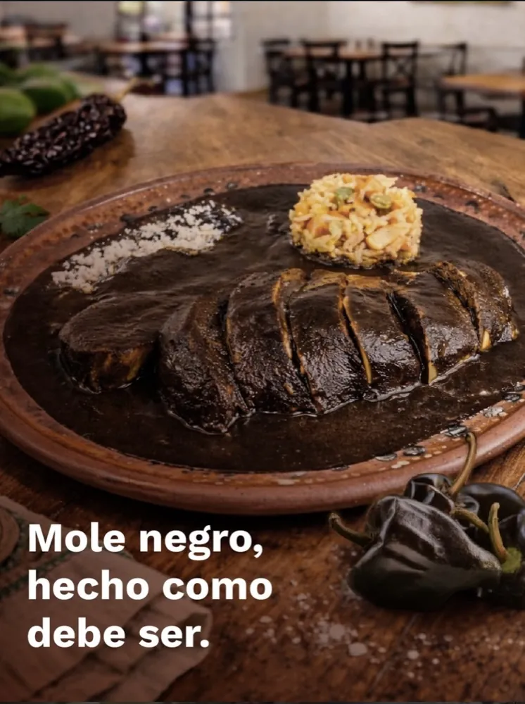
- Everyday life · Proximity · Community A more everyday expression of Oaxacan cooking, built around home-style flavors and a sense of neighborhood community in Santa María la Ribera.


From a family story to a brand ecosystem
- Corporate identity
- Brand architecture
- Restaurants
- Retail
- Website
- Social media
- Physical experience
- Communication materials
Every brand has a different role. They all begin in the same place.
00/03
Turning strategy into experience
Building the architecture was only the beginning. The real system had to work wherever people encountered the brands: across the table, inside a restaurant, while discovering a product, navigating the website, or coming across a post on social media.
Strategy therefore became a framework for deciding what each brand should say, how it should look, and what kind of experience it should create.
-
01
Differentiate
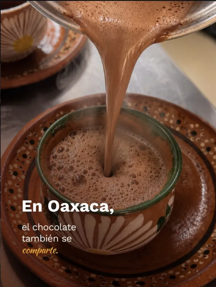
Casa Nela and Oaxacaquí could both speak about Oaxaca without telling the same stories. Casa Nela's editorial territory puts origin, family recipes and tradition at the center, presenting the table as a place where history continues to unfold. Oaxacaquí speaks from everyday life — dishes, processes, community, seasonality. At Aquí es Oaxaca Tienda, quesillo, meats, breads, moles, cacao, tlayudas and sweets let the experience continue beyond the restaurants.
-
02
Connect
The editorial strategy organizes these differences so the brands do not end up sharing interchangeable content, tone or reasons for being chosen. Differentiation does not happen through logos alone: it happens through the stories each brand tells, the products it highlights, its photography, its voice and the relationship it seeks to build.
-
03
Digitize
The website brought the brand architecture into a digital experience where users understand the broader world of the group and move between its concepts without erasing the identity of each one. It had to solve the same problem as the architecture: connect without confusing.
-
04
Operate
The strategy became an ongoing communication system: editorial calendars, photo and video production, static and motion content, recurring formats, publishing and community interaction, so the territories function in everyday operations.
Each brand tells its story in its own order
Follow each line in order: where a brand's stories begin, and where they lead.
-
Grupo Aquí es Oaxaca
The shared root- Oaxaca
- Family
- Food
- Mexico City
-
Casa Nela
- Origin
- Story
- Tradition
- Experience
- Table
-
Oaxacaquí
- Dish
- Process
- Proximity
- Community
- Everyday dining
The strategy could not live in a presentation. It had to survive the following Monday's content calendar.
00/04
What changed
The project transformed a collection of concepts connected by a family story into a defined brand architecture, supported by a corporate identity capable of explaining what belongs to the group, what distinguishes each brand, and what should remain shared across them.
Grupo Aquí es Oaxaca now has a strategic platform articulating its purpose, values, personality, tone of voice and narrative territories; a corporate visual system; and an architecture that organizes three distinct brands around a common origin.
That structure was then translated across different scales and touchpoints: from identity, uniforms and operational materials to digital communications, content and the website.
More importantly, the identity provides a foundation for the group to continue welcoming new generations, experiences or business lines without having to reinvent its story every time it grows.
The project continues to evolve, so we are not yet attributing specific commercial results to the new system.
Three brands. One story that began long before any of them.