Branding · Visual Identity · Retail · Implementation
MOGOTE
A local hardware store in Mogote de Bagaces, Costa Rica, offering a broad range of products for construction, maintenance and home improvement — serving the local community, professionals and people traveling through the area.
00/01
The diagnosis
Problem
MOGOTE was competing with larger, more established hardware retailers in the region. While its location placed it much closer to the local community, its identity did not communicate the breadth of its offering or take advantage of the visibility of a store strategically located along a major road.
Objective
Build a distinctive identity that could stand apart from the category's larger players, leverage the store's location, and position MOGOTE as a convenient, well-stocked and competitive alternative.
The project began with a seemingly simple request: create a logo that would look different from the large hardware retailers in the region. But before designing it, we looked at the business, its surroundings, its customers and the unique characteristics of its location.
What we found was a hardware store with a much broader offering than people might expect from a local business, a highly visible storefront, and a location with the potential to become one of its strongest communication assets.
-
01
Being closer didn't automatically make MOGOTE the first choice. The next alternative was roughly eight kilometers away, but proximity alone did not guarantee preference. MOGOTE needed to communicate that shopping locally did not mean settling for less variety, higher prices, or giving up what customers expected to find at larger hardware stores.
-
02
The store already stood out. The brand needed to make it memorable. Located at a roadside intersection, the store featured a predominantly black exterior with a strong visual presence. The opportunity was to turn that physical visibility into brand recognition.
-
03
The identity had to say “hardware store” without looking like every other one. Tools, screws, nuts and industrial cues are part of a visual language people immediately associate with the category. The challenge was not to eliminate those codes, but to use them in a distinctive way that could build recognition without mimicking the identity of larger chains.
MOGOTE didn't need to compete on size. It needed to turn proximity, location and visibility into an advantage.
00/02
Designing for recognition
The identity started with two elements the client was clear about from the beginning: black and green as the primary colors. From there, we built a high-contrast visual system designed to work both within the physical store environment and across the brand's different touchpoints.
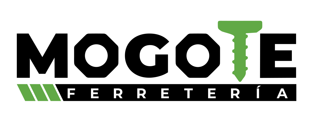
The logo combines the name of the community with recognizable elements from the hardware category. Nuts integrated into the letterforms and a screw incorporated into the wordmark make the nature of the business immediately recognizable without relying on a separate symbol.
-
01
The category, built into the name
Rather than pairing MOGOTE with a separate tool illustration, we integrated hardware elements directly into the typography. The identity communicates what the business does while building recognition around its name.
-
02
Contrast built for visibility
Black is the dominant foundation and green the distinctive accent, in a 70/30 relationship set by the brand guidelines, with a neutral gray to widen the range of applications. Against the store's dark exterior, the green creates contrast without competing with the architecture.
-
03
A language designed to extend
Diagonal forms, geometric elements, tools, product photography and a clear typographic structure carry the identity beyond the logo and into commercial communication, signage and digital media.
-
04
Together in every project
Proximity was never treated as purely geographical. “Together in every project” turned it into a brand idea: a hardware store close to the people who build, repair, maintain and transform the spaces around them. The line was carried across digital and commercial applications.
From the road to the point of sale
- Storefront
- Outdoor signage
- Roadside flags
- Advertising materials
- Social media
- Corporate materials
Every touchpoint had a different job. Together, they needed to make MOGOTE easier to recognize, find and remember.
00/03
Turning location into communication
MOGOTE's identity could not live exclusively in digital applications. One of the business's greatest opportunities existed precisely outside the screen: its location.
The store sits in a highly visible roadside location, but there were few visual cues helping people recognize the business before reaching it. We therefore extended the identity into applications designed to connect the journey with the point of sale.
- Identify
- The storefront became one of the brand's primary communication surfaces. The contrast between the black exterior, the logo and the green accents made the most of a building that already stood out within its surroundings.
- Guide
- Signage and roadside flag concepts extended the visual system beyond the storefront, creating brand presence before customers reached the store.
- Connect
- Social media, commercial communication and contact materials — from product categories and social posts to business cards and WhatsApp stickers — let the brand experience continue beyond the physical store.
The storefront stopped being simply where the brand lived. It became part of the strategy for getting the brand noticed.
00/04
What changed
MOGOTE went from having a name and a basic graphic identity to having a visual system designed to work across both its physical environment and its digital and commercial touchpoints.
The new identity established consistent standards for the logo, color, typography and brand applications, then extended them across the storefront, signage, roadside flags, digital communication, business cards, promotional materials and advertising.
Beyond creating a new logo, the project uncovered an opportunity that had not been part of the original brief: using the store's location and physical presence as communication tools in their own right.
The identity was subsequently implemented by the business, although we do not have sufficient data to attribute specific commercial results to the project.
Designing for local doesn't mean thinking small.